The issue of carbon emissions is not straight forward. Although rich industrialised countries by and large produce the most emissions, that does not necessarily mean that countries which are getting richer will produce more emissions.
As statistics compiled by the World Resources Institute (WRI) and illustrated in the graphics below show, factors such as emission intensity (the amount of output per unit of CO2 produced) and exporting emission-intensive production to other countries play a role in overall emissions.
All graphics were produced as part of the WRI's Climate Analysis Indicators Tool.

Per capita emissions are generally higher in richer countries but there is a notable clutch of gulf states; Qatar, United Arab Emirates, Bahrain and Kuwait that have some of the highest per capita emissions, mainly because of oil production.
Aside from the gulf states, the most notable contrasts are between some of the rich countries and the less industrialised, but rapidly growing ones. The US produces four times the per capita emissions that China does and 18 times that of India.
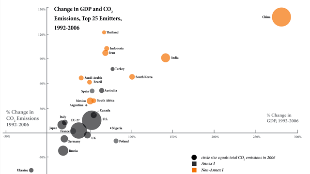
Change in GDP and CO2

Rises in gross domestic product (GDP) are usually strongly correlated to rises in carbon dioxide emissions.
For example, China saw GDP increases of more than 250 per cent between 1992-2006 and over the same period of time CO2 emissions rose by more than 120 per cent.
However, rises in CO2 emissions do not always lead to such spectacular growth in GDP. Thailand saw emissions rise by almost as much as China between 1992-2006 but saw a much reduced (around 50 per cent) increase in GDP in the same period. Indonesia and Iran had similar figures.
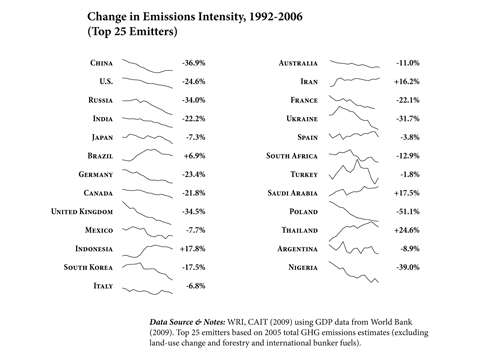
Change in emission intensity

Carbon dioxide emissions intensity is the level of CO2 emissions per unit of economic output. In other words, how much are you getting for every chunk of carbon you are polluting the atmosphere with.
In most countries the figure is falling however, the figures vary widely between some countries. Australia posted a fall of 11 per cent between 1992-2006, half that of India which managed a fall of 22.2 per cent.
This does not necessarily mean India is doing better than Australia as other factors such as the type of fossil fuels used or the fact that a country imports most of its emission-intensive products, may have played a part.
China, whose emission intensity fell by 36.9 per cent over the same period, has said recently that it would reduce its carbon intensity by 40 per cent on 2005 levels by 2020.
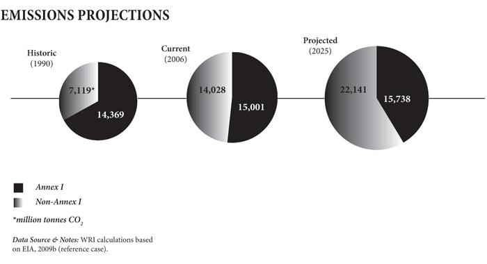
Projected emission growth

While annex I countries, which include industrialised nations like the US, Russia and Japan make up the majority of both historic and current emissions that is projected to be reversed within the next decade.
By 2020, non-annex I countries, which includes the non-industrialised states like China, India and Brazil are expected to account for the majority of emissions.
However, it is important to note that projections about future greenhouse gas emissions are dependent on current projections for economic, population and technological growth.
All graphics reproduced from the World Resources Institute's (WRI) Climate Analysis Indicators Tool (CAIT) Brochure for COP-15, Copenhagen" (based on CAIT v.7.0). Washington, DC: World Resources Institute.


